
08/19/2009
THE RETURN OF KISS CONTINUED

By Michael Doret
In developing and refining my pencil sketch for Sonic Boom I wasn't completely happy with how the background was working with the diamond shape and the positioning and scale of the lightning border (a small nod to RaRO). I also wanted to play up the idea of something shattering (i.e. from a sonic boom). So I came up with the semi-abstract idea of concentric circles rippling outward like water, only breaking up incrementally into smaller and smaller segments as they expanded, changing the background color from violet to black. It seemed like a fairly simplistic idea, so I tried it and it worked. It also seemed to serve well to both ground and amplify the light beams emanating from the center, which break through the faces. I went through several color iterations, ending with one that had a dark red bleed border. I showed that version to Paul. He looked at it for a minute and then suggested we just change the border to black. We both agreed that this worked better, finishing the design process on this piece.
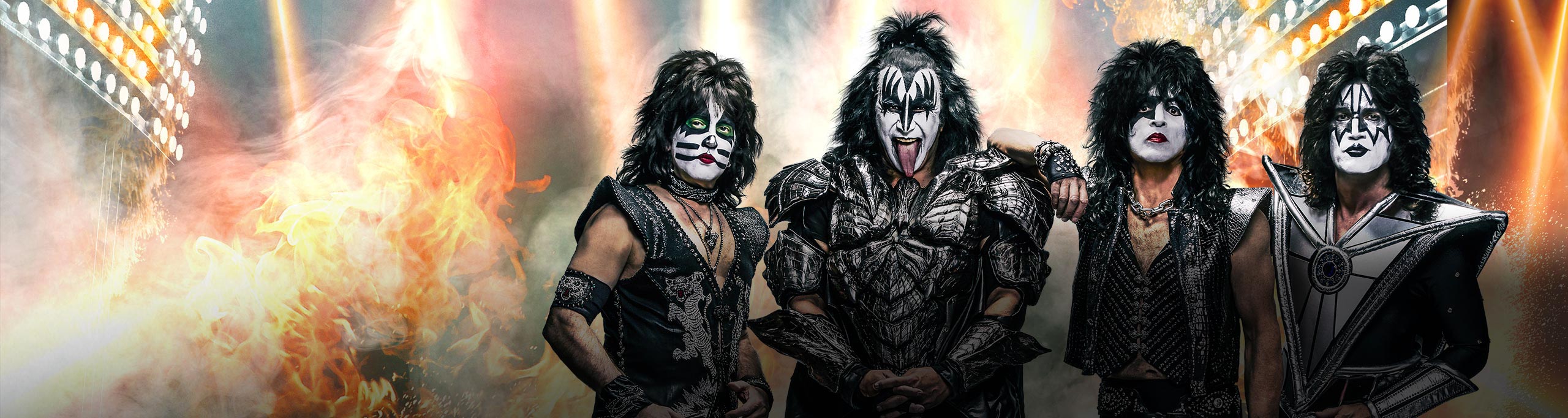
I did have to redo all the art for the CD/DVD package, which has a slightly more horizontal proportion. That meant shifting and manipulating the proportions of many of the elements. Because the angle of the beams had changed in the new configuration, the most complicated part of this was redoing all the faces. It's a little difficult to tell what went into the face art, transforming them from normal color photographs, so check out the enlarged detail to the left.By Michael Doret
In developing and refining my pencil sketch for Sonic Boom I wasn't completely happy with how the background was working with the diamond shape and the positioning and scale of the lightning border (a small nod to RaRO). I also wanted to play up the idea of something shattering (i.e. from a sonic boom). So I came up with the semi-abstract idea of concentric circles rippling outward like water, only breaking up incrementally into smaller and smaller segments as they expanded, changing the background color from violet to black. It seemed like a fairly simplistic idea, so I tried it and it worked. It also seemed to serve well to both ground and amplify the light beams emanating from the center, which break through the faces. I went through several color iterations, ending with one that had a dark red bleed border. I showed that version to Paul. He looked at it for a minute and then suggested we just change the border to black. We both agreed that this worked better, finishing the design process on this piece.
I did have to redo all the art for the CD/DVD package, which has a slightly more horizontal proportion. That meant shifting and manipulating the proportions of many of the elements. Because the angle of the beams had changed in the new configuration, the most complicated part of this was redoing all the faces. It's a little difficult to tell what went into the face art, transforming them from normal color photographs, so check out the enlarged detail to the left.
At first glance, it might look as though I accomplished this using some version of Photoshop's posterize filter�but I didn't. The photos needed to be manipulated quite extensively to gain the look I was trying to achieve. I used a similar process when I did the graphics for the Jewish Zodiac pieces.
I'm hoping this art will elicit strong reactions from KISS fans and art enthusiasts alike. My intention was to stir nostalgia for the era of Rock and Roll Over, while inviting the same enthusiasm for new adventure that the Sonic Boom albums and DVD intend to do.
The avid KISS fan will note that the KISS logo on Sonic Boom is not the "official" logo. As I did with RaRO, I redrew the KISS logo after discussing the idea with Paul Stanley. He knew that I had redrawn it for RaRO, and liked the result. In fact, he told me that I'm the only designer who he would ever allow to do that! Below I've posted an image with the official KISS logo (upper left) and just to it's right, my redrawn version. Below that are (on the left) the logo from Sonic Boom, and the one from RaRO.
Tinkering with the KISS logo, ever so slightly, was an important step towards seamlessly blending the iconic logo with the (hopefully) iconic cover design. I'm very happy with end result, which you see on the cover of Sonic Boom. It truly has been a pleasure to return to my roots, in essence, by rejoining the creative process with KISS. As it was the first time, this experience was one to remember! I can't wait for the next adventure...
In developing and refining my pencil sketch for Sonic Boom I wasn't completely happy with how the background was working with the diamond shape and the positioning and scale of the lightning border (a small nod to RaRO). I also wanted to play up the idea of something shattering (i.e. from a sonic boom). So I came up with the semi-abstract idea of concentric circles rippling outward like water, only breaking up incrementally into smaller and smaller segments as they expanded, changing the background color from violet to black. It seemed like a fairly simplistic idea, so I tried it and it worked. It also seemed to serve well to both ground and amplify the light beams emanating from the center, which break through the faces. I went through several color iterations, ending with one that had a dark red bleed border. I showed that version to Paul. He looked at it for a minute and then suggested we just change the border to black. We both agreed that this worked better, finishing the design process on this piece.
I did have to redo all the art for the CD/DVD package, which has a slightly more horizontal proportion. That meant shifting and manipulating the proportions of many of the elements. Because the angle of the beams had changed in the new configuration, the most complicated part of this was redoing all the faces. It's a little difficult to tell what went into the face art, transforming them from normal color photographs, so check out the enlarged detail to the left.By Michael Doret
In developing and refining my pencil sketch for Sonic Boom I wasn't completely happy with how the background was working with the diamond shape and the positioning and scale of the lightning border (a small nod to RaRO). I also wanted to play up the idea of something shattering (i.e. from a sonic boom). So I came up with the semi-abstract idea of concentric circles rippling outward like water, only breaking up incrementally into smaller and smaller segments as they expanded, changing the background color from violet to black. It seemed like a fairly simplistic idea, so I tried it and it worked. It also seemed to serve well to both ground and amplify the light beams emanating from the center, which break through the faces. I went through several color iterations, ending with one that had a dark red bleed border. I showed that version to Paul. He looked at it for a minute and then suggested we just change the border to black. We both agreed that this worked better, finishing the design process on this piece.
I did have to redo all the art for the CD/DVD package, which has a slightly more horizontal proportion. That meant shifting and manipulating the proportions of many of the elements. Because the angle of the beams had changed in the new configuration, the most complicated part of this was redoing all the faces. It's a little difficult to tell what went into the face art, transforming them from normal color photographs, so check out the enlarged detail to the left.
At first glance, it might look as though I accomplished this using some version of Photoshop's posterize filter�but I didn't. The photos needed to be manipulated quite extensively to gain the look I was trying to achieve. I used a similar process when I did the graphics for the Jewish Zodiac pieces.
I'm hoping this art will elicit strong reactions from KISS fans and art enthusiasts alike. My intention was to stir nostalgia for the era of Rock and Roll Over, while inviting the same enthusiasm for new adventure that the Sonic Boom albums and DVD intend to do.
The avid KISS fan will note that the KISS logo on Sonic Boom is not the "official" logo. As I did with RaRO, I redrew the KISS logo after discussing the idea with Paul Stanley. He knew that I had redrawn it for RaRO, and liked the result. In fact, he told me that I'm the only designer who he would ever allow to do that! Below I've posted an image with the official KISS logo (upper left) and just to it's right, my redrawn version. Below that are (on the left) the logo from Sonic Boom, and the one from RaRO.
Tinkering with the KISS logo, ever so slightly, was an important step towards seamlessly blending the iconic logo with the (hopefully) iconic cover design. I'm very happy with end result, which you see on the cover of Sonic Boom. It truly has been a pleasure to return to my roots, in essence, by rejoining the creative process with KISS. As it was the first time, this experience was one to remember! I can't wait for the next adventure...